Don't treat websites like art
In his 2011 book Designing for Emotion, Aaron Walter proposed a hierarchy of user needs. The hierarchy progresses through functional, reliable, usable to pleasurable. If you fulfil all these needs then you give users “delight”.

This hierarchy has become a popular paradigm, and certainly confirms my own experience. In fact, I’d say with some individuals, you can remove the “pleasurable” bit at the top, since they are not sensitive to the aesthetics of websites, but very sensitive to whether they can find things on the site or not.
Unfortunately, the bottom layers of the hierarchy are often skipped, and instead discussions revolve around what is fashionable in graphic design and technology. One reason for this is the way decisions are made about websites.
When people in an organisation discuss them, the criterion for success is that they look cool, and not, “We’ve watched people use the site and people can find what they need to.” In other words, the site is viewed primarily as a piece of art or visual design.
To keep focusing on what’s most important, we can ask the questions we looked at in Don’t skip the strategy, like “Why does the website or app exist?”
Design blindness
People have different sensitivities to graphic design. Some people have strong feelings about it, and notice subtle differences in colours and font shapes, whereas others barely notice aesthetics at all.
I’ve shown choices of three designs to people, and some people have gone into a close analysis of what they like or dislike, whereas others have looked blank and said, “What’s the difference?”
The aesthetically sensitive don’t necessarily know the aesthetically indifferent exist (see Beware of false consensus). Individual differences in aesthetic sensitivity have been extensively studied by psychologists. For example, see A new conception of visual aesthetic sensitivity by Corradi et al. (2019) and its references.
What ths means is that some of your users will hardly notice the effort you put into the appearance of your site. They are more likely to notice if they can’t do what they want to do.
This does not mean aesthetics is not important. For many people, aesthetics make your site more pleasurable to use, and make it look more professional. But graphic design follows what’s usable and functional.
In case you think I’m being too cynical about decision-making in organisations, here’s a little anecdote. I was once at a UX conference where we had all these talks about how to get user feedback, and how to let that guide the development of your project.
One afternoon we had a workshop where we were split into groups of four or five. The facilitator gave each of us a piece of paper with a target printed on it, like an archery target. There were three concentric rings. The facilitator said, “Just individually, I want you to write in the middle of the target who is the most influential in shaping your site, then in the second ring put the people who are second most influential, and finally in the third ring put the people who have a bit of influence but not much.”
When we’d finished, she said, “Now show your target to the rest of your group and discuss.” We showed our targets to each other and laughed. We’d all put the same: in the middle were the managers, and in the outer edge were the users.
The decisions were based on what looked good to senior staff, not on what worked for users.
Case Study: archives you can’t search
In the UK each county has an archives that holds historic documents for that county. One of the main things you want to do on an archives website is to search. Perhaps you’re researching your family history or local area, and you want to look for relevant records.
An archives near me launched a site that looks nice, but where the advanced search doesn’t work. Every search returns 62,625 pages of results, presumably all the records in the archives.
Occasionally you get no results, in which case a message says “@todo No posts page”. This is a note the web developers left in to remind themselves to make a “No results” page, but they never made the page. No-one checked the search enough to notice the page didn’t exist.
The site does not pass the base layer of Walton’s Pyramid: functionality. Yet it went live, and I an only assume it was based on the top layer: it looked nice.
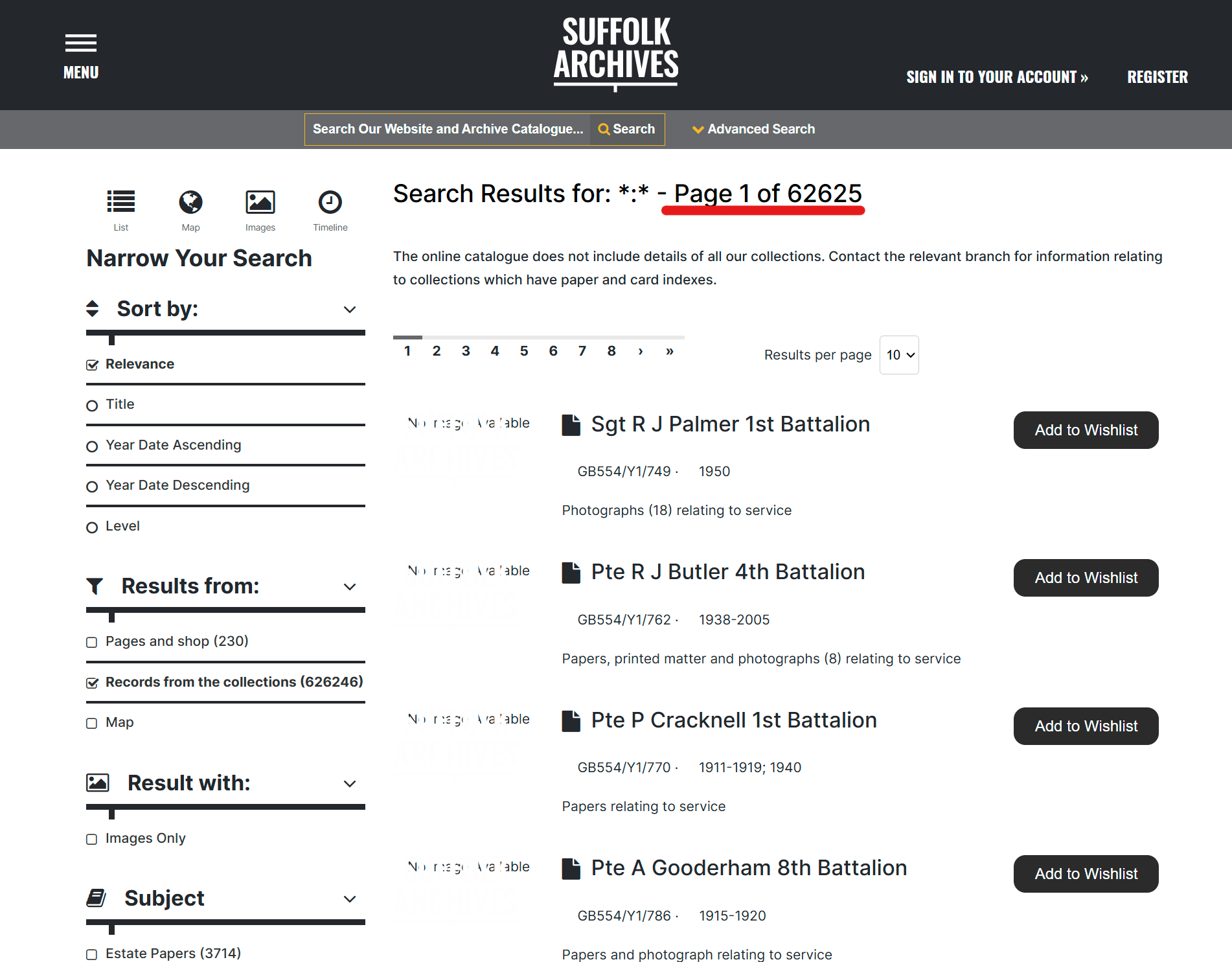
There are a couple of other usability issues. The search form has no submit button, which may look clean, but how do you submit a search? You can press return, but that returns all records in the database, so how do you know the form submitted properly?
The advanced search form does not save search terms. If you want to go back and tweak one term, then you have to type all our terms in again. Testing with one user would probably have flagged all this (see Test little and often).